Strip a game down to a limited palette and a handful of buttons and you cannot hide a weak idea behind a particle effect. That constraint is why so many classics still feel sharper than games with a thousand times the budget.
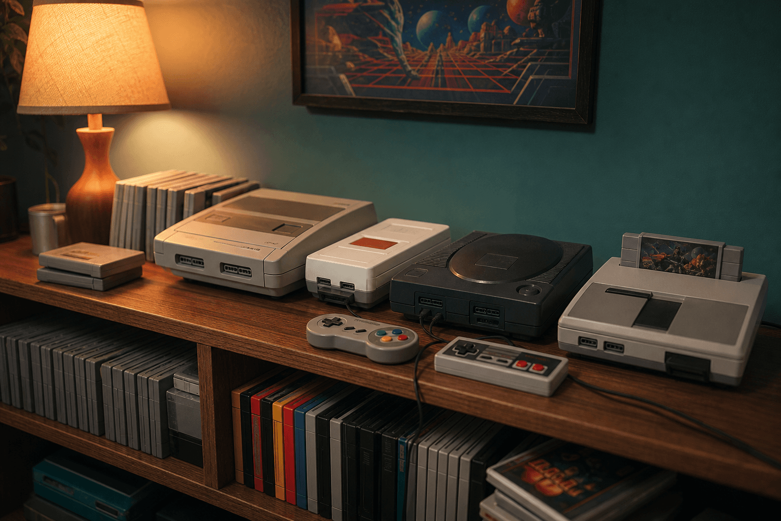
Constraint as a design teacher
When you only have a handful of pixels to communicate a threat, every silhouette has to read instantly. That discipline produced visual languages so clear that players understood them without a tutorial.
- ✓Readable silhouettes over photoreal detail.
- ✓Tight feedback loops measured in frames, not cutscenes.
- ✓Difficulty that teaches instead of gatekeeps.
“Every modern innovation in game feel we found was already solved on a cartridge in 1991. We just had to go look.”
— Neon Syndicate design retrospective
Retro is not a style to imitate — it is a set of lessons to internalize. The games that age best respect the player's attention.